
Localized Onboarding for Global Finance
TL;DR:
Redesigned onboarding for country-specific requirements, moving regional logic earlier and clarifying blocked and review states. Improved accessibility and added recovery mechanisms such as OCR fallback, manual entry, progress tracking, and re-entry. Extended the work into desktop and mobile dashboards that made pending tasks, application states, and transaction activity easier to monitor. Result: 28% lower drop-off, 30% faster onboarding, and 40% faster validated decisions over six months.
What Broke:
Users did not always know which path applied to them. People could invest time before discovering missing requirements, invalid documents, or branch-specific constraints.
At the same time, fragmented tooling, inconsistent terminology, and manual data entry increased drop-off and invalid submissions at the points where eligibility and next steps mattered most.
What Had to Be Constrained:
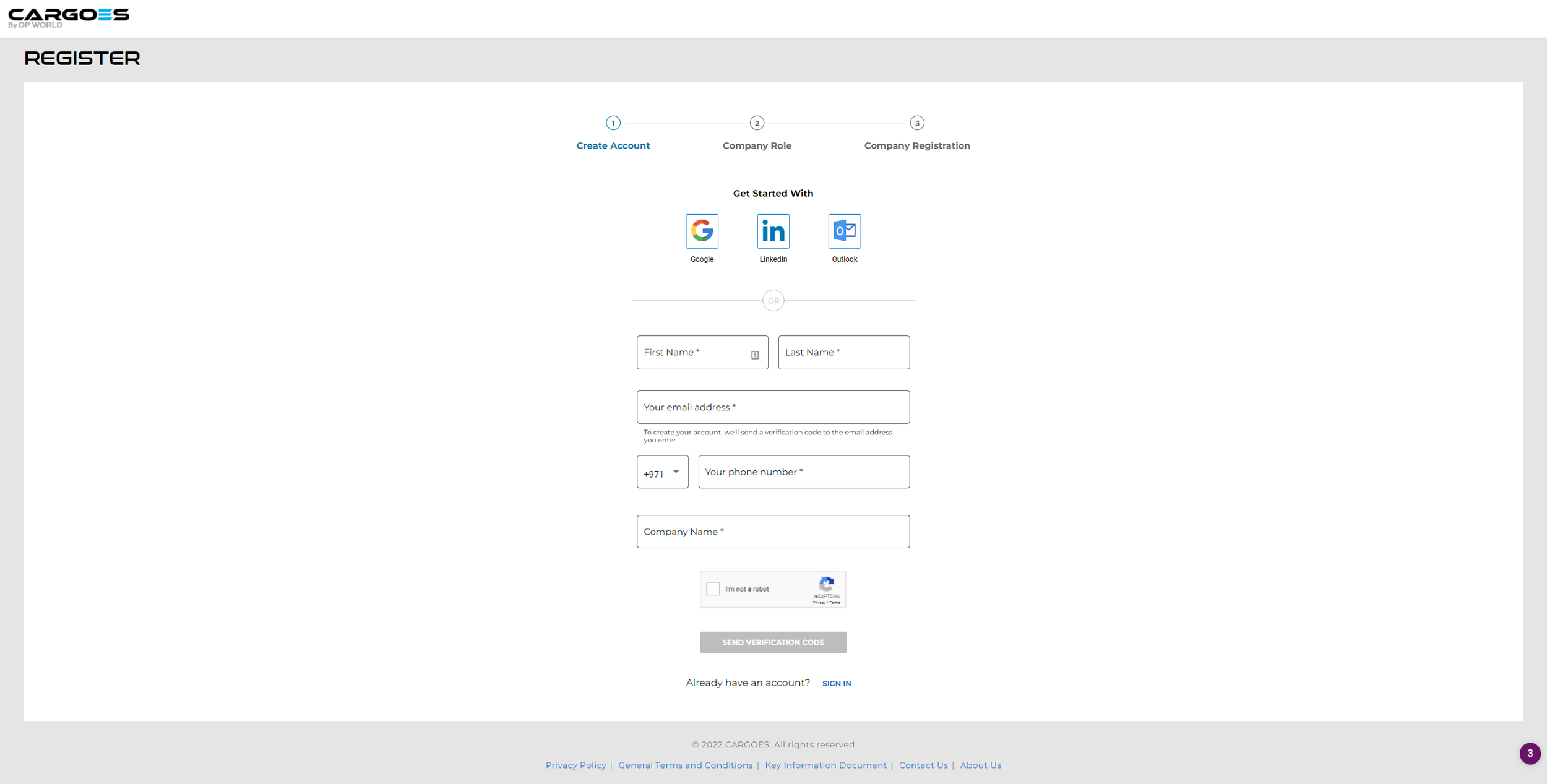
I redesigned onboarding around explicit progression states instead of a single generic path.
Region-specific logic was moved earlier to align with UAE and Cayman Islands requirements before users advanced too far.
Clear validation gates prevented progression until required conditions were met, while continue, blocked, and review states were made explicit.
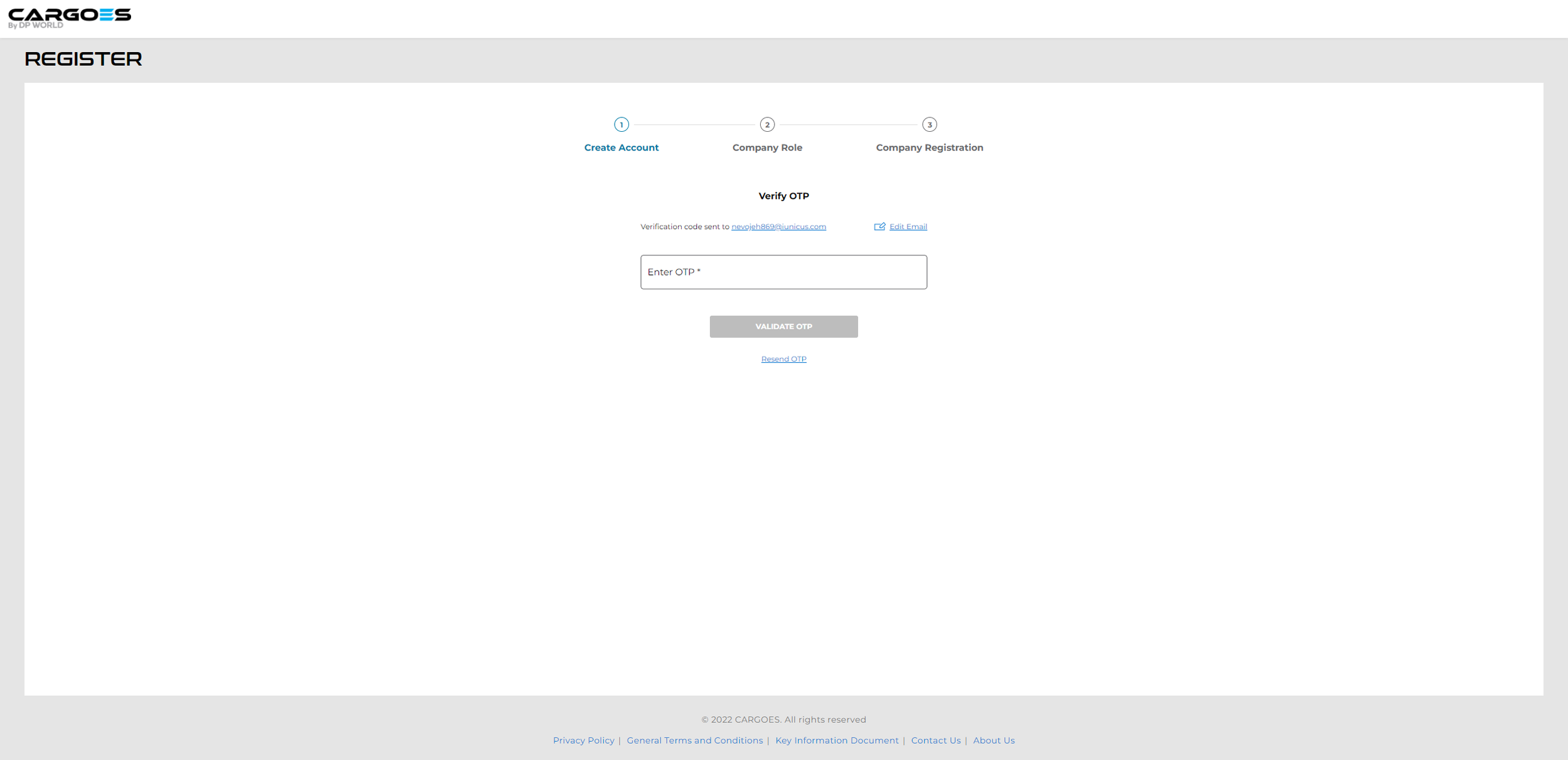
The flow supported multiple entry paths, including OCR-assisted onboarding with manual fallback, a status tracker so users could recover from interruptions, wrong-path choices, and incomplete steps without restarting.
How Users Recovered and Moved Forward:
The workflow supported multiple recovery paths.
If OCR failed, users could switch to manual entry.
If users entered the wrong resident path, they had to reapply through the correct flow.
If users were interrupted, a visual tracker helped them resume.
If required data was inaccurate or incomplete, the application was blocked.
If approval conditions were met and final data was complete, the case moved into review.
The strongest change was making these edge cases visible as product states instead of leaving users to infer what had gone wrong or what they needed to do next.
Flows for different regions:
Non-UAE Residents Workflow
UAE Residents Workflow
Dashboard Visibility and Operational Follow-Through:
I redesigned dashboard views to prioritize pending tasks, financing status, application state, and transaction visibility across desktop and mobile.
The goal was not just to present more information, but to make current status, next actions, and incomplete work easier to spot.
What Got Standardized:
The biggest win was a consistent operating model for how users progressed through onboarding and how status remained visible after entry.
I standardized:
Field validation rules
Branching behavior
Onboarding templates
Progress tracking
Recovery states
Review states
Region-specific onboarding logic
This made the workflow easier to scale across the product suite without losing consistency in how users entered the system, recovered from interruptions, or moved into review.
Outcome:
The team measured results against a six-month before-and-after baseline.
Results:
28% reduction in application drop-off
30% reduction in onboarding time through automated verification
40% faster validated decisions
Most importantly, the redesign created a clearer progression model with earlier branching, explicit status, visible blocked and review states, and lower manual effort through OCR-assisted verification.
What This Case Study Shows:
This case shows that I can design for localization, accessibility, branching logic, and recoverability in regulated systems. It is the best proof in the set that I understand product behavior at the edge cases, where most enterprise software starts quietly falling apart.
Final Onboarding User Flow:
Final onboarding flow showing branching, verification, and progression from entry to activation.
Carousel below shows pages in succession.


Final Dashboard Designs:
The dashboard redesign prioritized pending tasks, financing status, application state, and transaction visibility across desktop and mobile. The redesigned views made task status and application activity more visible in the default view.
