
Turning Regulated Data into an AI Ingredient Educator
TL;DR:
Challenge: Ingredient data is fragmented across regulatory and scientific sources. In consumer-facing AI tools, that creates pressure to flatten uncertainty into simple answers.
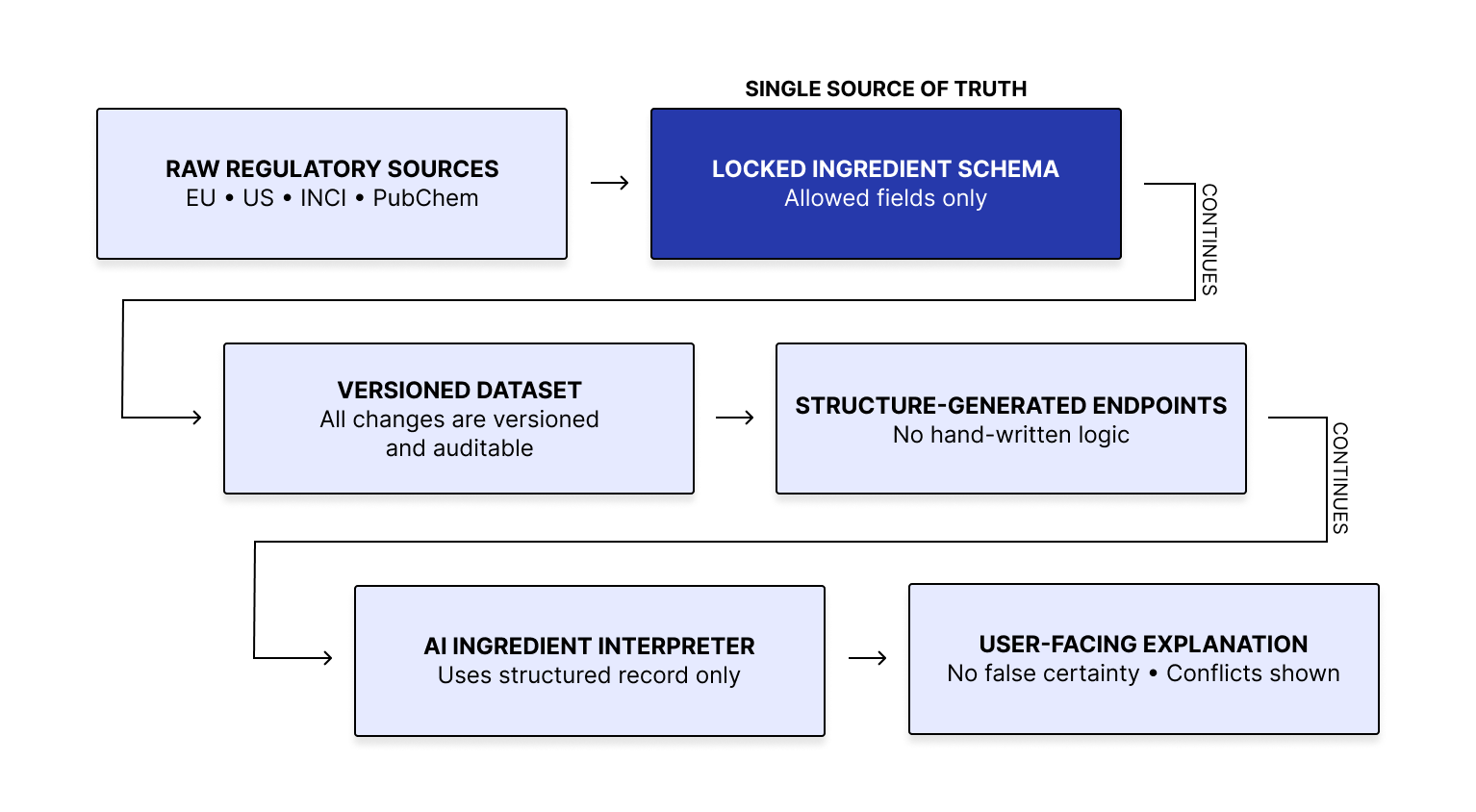
What I’m building: I’m designing an AI ingredient educator that turns regulated ingredient data into plain-language explanations without going beyond the record. The system uses a shared schema to standardize source data, versioned processing to keep outputs traceable, and explanation rules that limit unsupported inference.
Wins:
Zero hallucinations across 50 pressure-test queries
96% strict schema compliance
Schema-bound, version-traceable outputs
Explanations that surface conflicts and unknowns instead of masking them
Project Info:
Role: System design, data constraints, UX logic, explanation behavior, project management, and assisted coding.
Scope: Schema design, interpretation rules, validation approach, and user-facing explanation patterns for an AI ingredient education system.
Platform: AI-powered ingredient education tool built on regulated skincare data.
Tools: Figma, structured schemas, system modeling, validation testing, versioned data pipelines, and assisted Python coding.
Problem & Design Insight:
Ingredient information is fragmented across regulatory bodies and scientific sources that differ in naming, formatting, permitted use, and restrictions.
In a consumer-facing AI tool, that creates pressure to collapse ambiguity into a clean answer. Without clear boundaries, the system can overstate what is known, hide contradictions, and produce explanations that are hard to verify later.
That led to a core design decision: uncertainty has to be part of the output, not treated as a failure case. When information is missing, conflicting, or weakly supported, the system should surface that boundary explicitly rather than fill it with plausible language.
System Design:
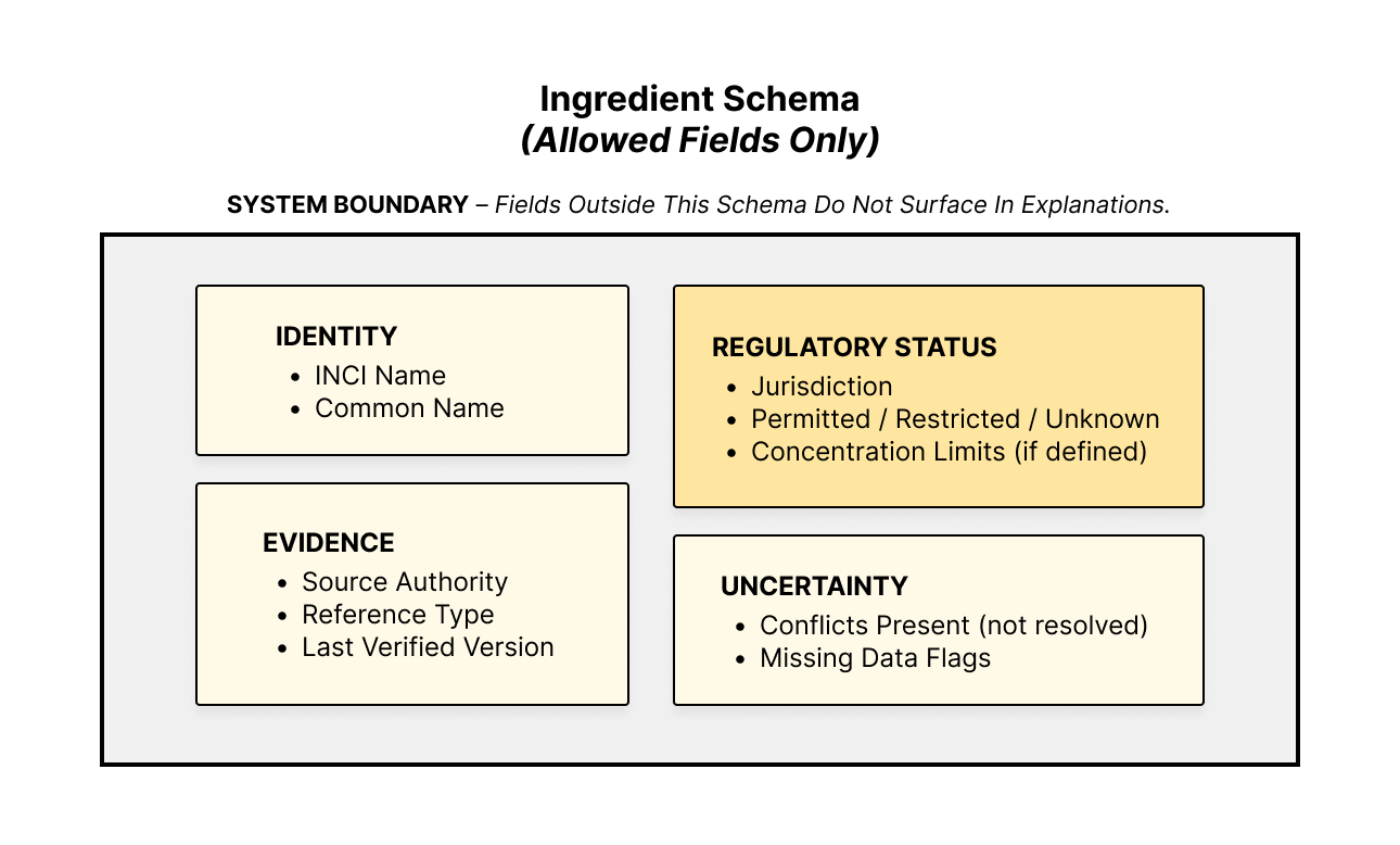
I’m using a single shared schema to define every ingredient field the system is allowed to use. That schema acts as the source of truth across the platform. When the schema changes, the database, endpoints, and interpretation format change with it. This reduces drift between what the system stores, serves, and explains.
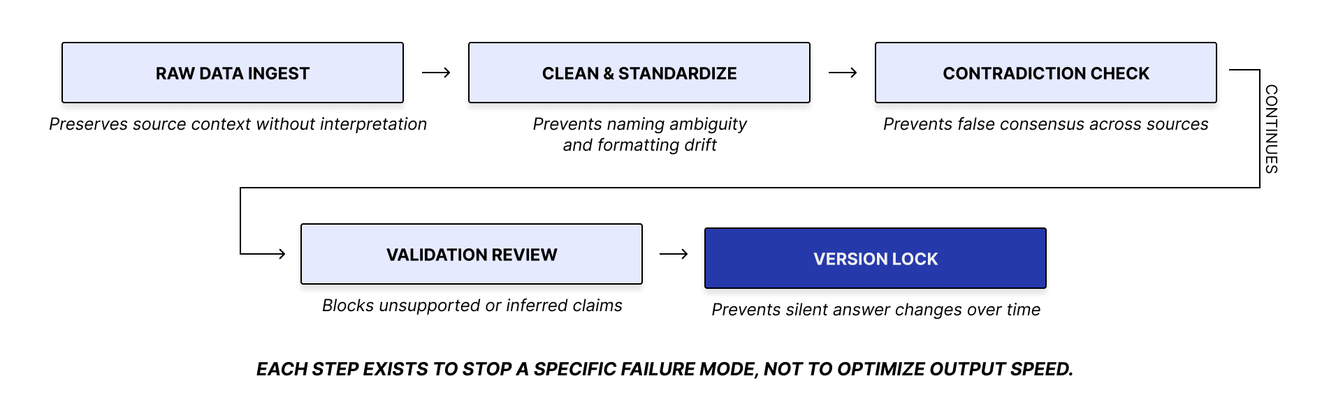
Each ingredient moves through the same versioned pipeline. If the underlying data changes, the version changes with it. That makes every explanation traceable to a specific data state and prevents silent shifts in system behavior over time.
The interpreter uses the structured ingredient record as its sole reference. Explanations are generated from the record, not from freeform inference. If information conflicts, the output surfaces the conflict. If information is unknown or undocumented, the system does not infer beyond what can be verified
Testing:
I tested the system with ingredient-related queries designed to pressure-test behavior under incomplete and conflicting data. The questions covered safety, compatibility, concentration limits, edge cases, and ambiguous real-world phrasing.
The goal was not maximum coverage. It was to expose failure modes such as hallucination, contradiction masking, and unsupported inference when the data is weak or incomplete.
Outcomes:
The system keeps outputs tied to versioned data and a defined structure. It preserves boundaries between known, conflicting, and undocumented information, and it makes changes easier to trace over time.
50 real-world queries
0 hallucinations
96% strict schema compliance
All outputs schema-bound and version-traceable
Known Limits:
Some failures come from the dataset, not the interface.
Some ingredient queries lack a dedicated signal for debated compounds.
Some dual-filter queries return zero matches when a near-match fallback would be more useful.
Some questions fail because the dataset does not include the needed field, such as texture or pregnancy safety.
Some usage-intent questions exceed what the current fields can support cleanly.
Next Steps:
Automate regulated data gathering
Expand coverage to 80+ ingredients
Test with non-expert users
Refine explanation depth and tone
Add stronger provenance and update checks to keep
Explanations aligned with the underlying data as the system scales
Reflection:
Designing under uncertain data keeps forcing the same requirements: constrain outputs to verified inputs, surface ambiguity explicitly, preserve traceability as data changes, and limit unsupported inference through system structure. Some queries fail because the dataset lacks the needed field. Some answers expose ambiguity the record cannot resolve. As coverage expands, provenance and freshness checks matter more than answer fluency.