
Simplifying Financial Decision-Making with Scalable UX
TL;DR:
Philosophy: The goal was to reduce uncertainty and standardize decision quality through structured, compliant UX systems.
Challenge: Users encountered hesitation and drop-off due to inconsistent language, redundant onboarding steps, and disconnected workflows across financial tools.
What I Did: I led a cross-functional redesign to formalize decision flows and implement modular UX components aligned with compliance standards
Wins:
28% drop-off reduction through structured task flows, 40% faster validated user decisions, and 30% faster onboarding via automated verification
Component library reused across product suite to ensure uniformity and reduce maintenance risk
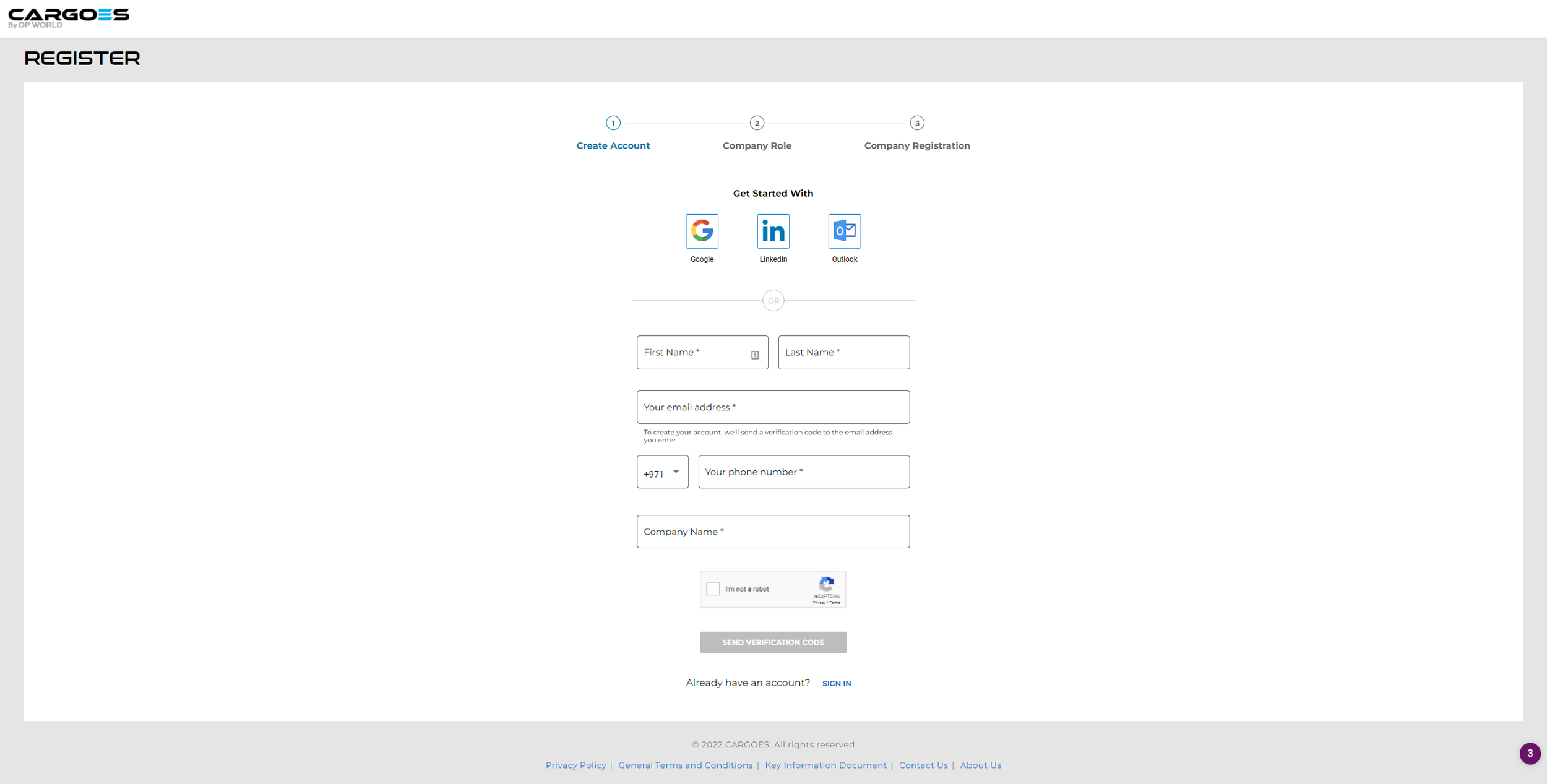
Project Info:
Role: Lead UX Designer, embedded with global product, engineering, and compliance teams.
Scope: End-to-end UX for loan application and dashboard (research, IA, system logic, testing, and pattern governance)
Platform: Responsive fintech dashboard for regulated loan applications.
Tools: Figma, journey mapping, moderated testing, OCR/KYC automation, design-system governance.
Challenge:
The objective was to create a predictable, low-error experience across the fragmented financial tools.
Pain Points
Terminology risk: Labels and microcopy caused misinterpretation.
Workflow fragmentation: Disconnected userflows led to decision stalls.
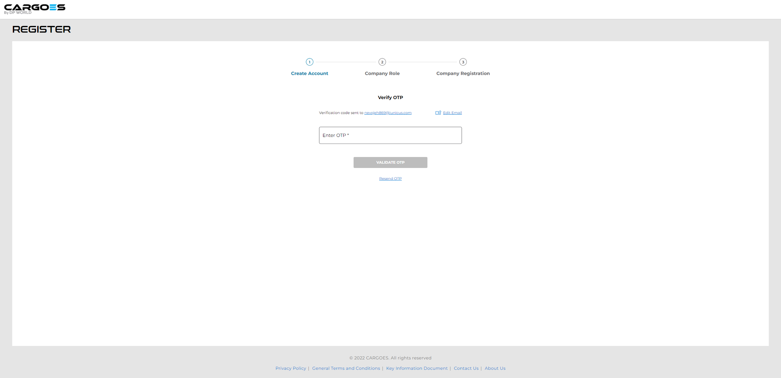
Manual onboarding: Redundant data entry created friction and compliance exposure.
The redesign unified the tools into a verifiable, repeatable flow, improving user confidence, and internal auditability.
Research & Discovery:
User Interviews: Exposed low confidence in toos and misunderstood the features.
Behavioral Logs and Support Tickets: Revealed abandonment spikes tied to redundant manual input and lack of context.
Stakeholder Workshops: Facilitated a shared understanding of friction points and reframed challenges into design opportunities.
Key Insight: The tools had to anticipate uncertainty and quietly support each decision stage.
Notes from the Reverse the Problem exercise:
Reframing issues as opportunity areas shifted focus from pain points to outcomes and scalability.
Click to enlarge image.
Notes about dashboard best practices:
This informed visual logic and layout decisions, prioritizing responsiveness and data disclosure.
Click to enlarge image.
Why Me:
I build UX systems that scale and stay consistent under pressure. My approach translates complex systems into usable patterns that help users make confident decisions across regulated, data-heavy environments.
Design Decisions:
Comparison tools: Made it easy to line up options side by side so users could see differences quickly and informed choices.
Step-by-step flow: Showed only what was needed at each stage, keeping attention focused and reducing mistakes.
Clear navigation: Grouped tools the way people naturally search for them, by purpose, type, or urgency, so nothing felt hidden or random.
Visual cues: Added status highlights and confirmations so users always knew what action they’d taken and what came next.
Medium-fidelity mockup:
The mockup demonstrated how adaptive UX and progressive disclosure improved flow for both scenario and comparison driven users.
Click to enlarge image.
Userflows & Rationale:
Behavioral flows modeled user intent states rather than personas to ensure global scalability.
Scenario-first users: Guided step-through user flows with validated checkpoints.
Compare-first users: Structured exploration with kept user actions traceable and easy to review later.
Localized variants (UAE and non-UAE) integrated OCR and KYC automation to ensure regulatory compliance and reduce onboarding errors.
Flows for different regions:
Non-UAE Residents Workflow
Click to enlarge image.
UAE Residents Workflow
Click to enlarge image.
Testing & Iteration:
Conducted cross-platform usability testing that focused on completion accuracy.
Benchmarked decision latency, hesitation, and first-click precision.
Iterated on hierarchy, form density, and field validation to ensure understanding in alignment with compliance requirements.
Outcomes:
Before: Disconnected workflows and inconsistent language created ambiguity.
After: Unified IA, standardized terminology, and verifiable flows reduced decision friction.
Before: Manual verification increased human error.
After: Automated OCR/KYC reduced input time and compliance exceptions.
Before: Users lacked confidence in tool selection.
After: Predictable pathways increased completion rates and reduced escalation tickets.
Reflection:
Designing for regulated environments requires more than usability, it requires predictability. The final system demonstrated that trust is earned through consistent structure, measurable outcomes, and cross-team accountability.
Product Images:
Final Onboarding User Flow
This show the final optimized onboarding user journey from entry to activation. It demonstrates clarity, speed, and tailored logic across resident types and tool needs.
Carousel below shows pages in succession.


Final Dashboard Designs
The final dashboard mockups present streamlined insights through prioritized data visuals, enabling faster comprehension and confident user decisions at a glance. The mockups are for desktop and mobile.
Click to enlarge images.
Desktop Before
Click to enlarge image.
Desktop Mockup After
Click to enlarge image.
Medium Fidelity Mobile Mockup

Click to enlarge image.
High Fidelity Mobile Mockup
Click to enlarge image.