

Geospatial Dashboards for Mission-Critical Operations
TL;DR:
I made updates to a geospatial dashboard used by the military. It was simpler for the operators to switch between different map views, C2 phases, and AI indicators, all while maintaining focus on their tasks. This led to a clearer understanding of the situation, allowing for better coordination during urgent events.
Note: Due to security protocols, product visuals, wireframes, and quantitative metrics are redacted. This case study focuses on workflow structure, interaction logic, and abstracted outcomes that are safe to share publicly.
What Broke:
Here were the complaints:
Users found it challenging to identify the areas needing attention
Coordinating on the geospatial map with the AI data could be difficult
Escalation and override paths were present but difficult to follow
Users could lose their place while moving across tasks or while handing work to another person
As a result, users had to infer authority, ownership, and recovery paths across fragmented flows with inconsistent signals.
Design constraints for the project:
Different roles had different needs in the same operating screen
Users had to maintain map context while reviewing data
Critical signals had to remain visible without cluttering the interface
Escalation, override, and reassessment workflows needed to be explicit and recoverable
Work had to support handoffs without making users reconstruct the data
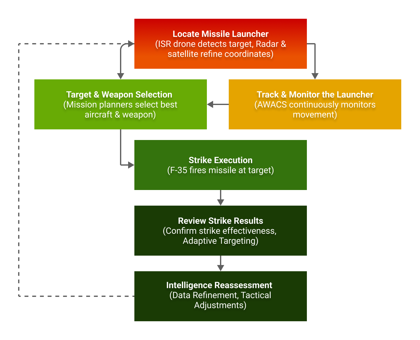
How I Designed:
I redesigned the shared command-and-control around the questions users needed answered immediately.
What needs attention right now?
What changed in the operational picture?
What evidence supports action?
What does the user need to do next?
Task Trace: Before and After:
Before
AI recommendations appeared in the shared interface without an obvious owner
The system did not clearly show who needed to verify the data, who needed to escalate it, or what stage the workflow was in.
Users had to infer authority, next steps, and recovery options across fragmented tools and inconsistent signals.
Reassessment required extra coordination because ownership and prior actions were not explicit.
After
AI suggestions were sent to the appropriate person instead of being presented as general, shared prompts.
The interface surfaced decision-critical information first while preserving access to deeper evidence.
Each recommendation made the workflow state, responsible actor, and next actions more explicit.
Users could verify, escalate, hand off, or loop back from the current screen without restarting or losing context.
Reassessment became easier because prior action and ownership were easier to see within the workflow.
Outcome:
The design was reviewed in operator simulations and at a military research event. I interviewed 14+ people for research. Because quantitative metrics are redacted, I’m highlighting structural outcomes.
The redesign produced:
Clearer ownership of AI-driven recommendations
More explicit hand-off points between roles
Less friction when users needed to verify, escalate, or revisit a recommendation
Better continuity because users could act from their current screen without losing their workflow

What This Case Study Shows:
This example shows my ability to build geospatial dashboards for operational settings. It also demonstrates how I structure decision support around role clarity, escalation behavior, and ambiguity management without overwhelming the user.
In high-stakes environments, the focus is on making responsibility clear, outlining simple courses of action, and enabling recovery when situations develop.
Citation:
U.S. Air Force. (2023). Air Force Doctrine Publication 3-60: Targeting. Retrieved from https://www.doctrine.af.mil/Portals/61/documents/AFDP_3-60/3-60-AFDP-TARGETING.pdf
U.S. Air Force. (2024). U.S. Allies and Partners Integrate for Dynamic Targeting: Kill Chain Automation Exercise. Retrieved from https://www.7af.pacaf.af.mil/News/Article-Display/Article/3661445/us-allies-and-partners-integrate-for-dynamic-targeting-kill-chain-automation-ex/